Back research Jun 2025
Designing a Visual Language for the Road
In the late 1950s, post-war Britain experienced rapid growth in car ownership, as well as a modernisation of its road infrastructure. It quickly became apparent the need for a clear and consistent signage system to replace the existing chaotic and often illegible signs. Designer Herbert Spencer documented this confusion in an issue of Typographica magazine called “Mile-a-minute Typography?”, highlighting how motorists would often encounter a jumble of different typefaces, symbols and colours, even along a single journey. This caused the British Government to commission Jock Kinneir, a graphic designer known at the time for his work on signage for Gatwick Airport, as well as Margret Calvert, a former student of his at Chelsea School of Arts to undertake a nationwide redesign. Together they developed a visual language that could communicate essential information quickly, legibly, and without ambiguity. This essay aims to examine the resulting system, focusing on its typographic innovations, as well as its use of colour coding.
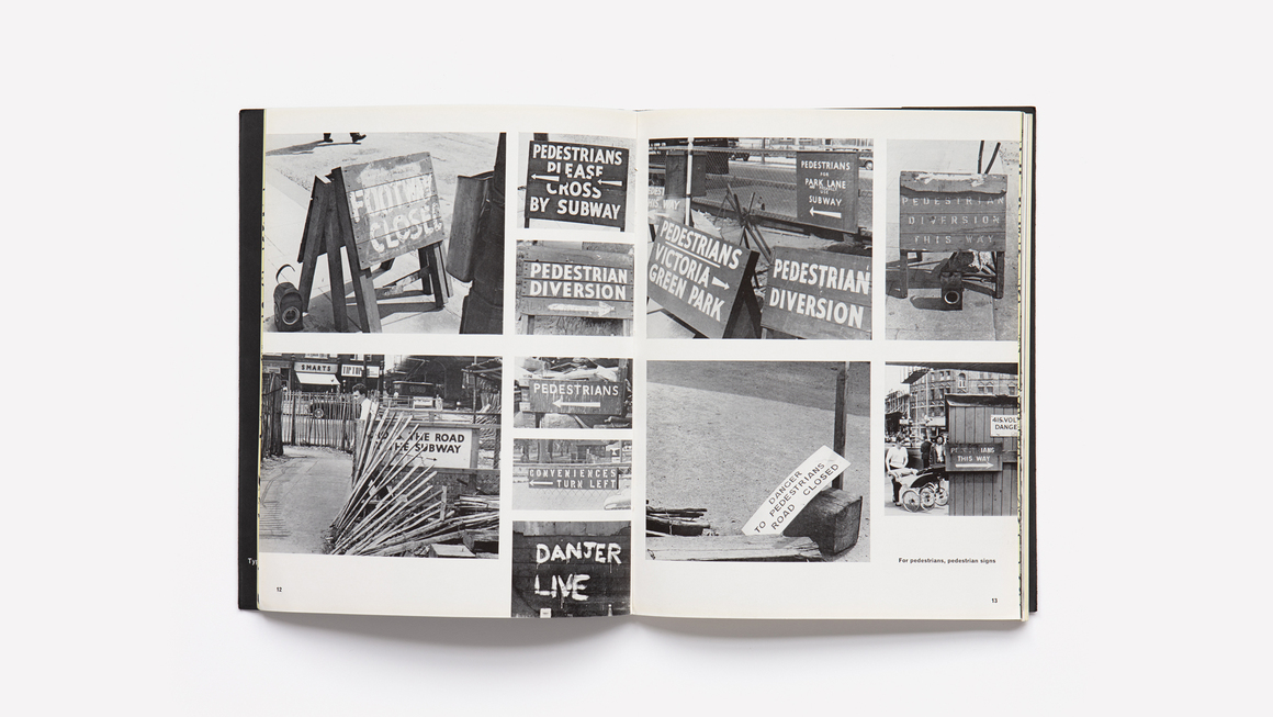
Before the involvement of Jock Kinneir and Margaret Calvert, British road signage was a mess. Existing signs, which were designed for far slower forms of transport, lacked standardisation and often changed from road to road. Iconography, such as arrows, varied from thick to thin line-weight, typography differed from hand painted lettering to bold sans-serif glyphs and there was no clear cohesion between the shape and colour of the sign. Often it was a wooden rectangle, demonstrating no meaning to onlookers. Furthermore, the 1950s marked a large increase in private car ownership, as well as the building of the first motorways. This combination of problems was highlighted by typographer Herbet Spencer in his 1961 article “Mile-a-Minute Typography?”, featured in the magazine Typographica. The article documented a journey through London, demonstrating the inconsistent visual language, emphasising the dangers this posed to both motorists and pedestrians.
In response to this issue, the government formed two committees. Initially the Anderson Committee was tasked with developing unified signage for the country’s first motorway. To help with this, they brought on Jock Kinneir, a designer who studied at Chelsea School of Art, where he later taught, as well as being the head of graphic design at the Royal College of Art. To help him with the project, he chose Margret Calvert. Calvert was a student of Kinneir’s whilst at Chelsea and they then worked together on the signage at Gatwick, and later luggage labels for P&O Cruises. Their success at reworking the motorway signage led to the creation of another committee, the Worboys Committee. The goal of this second initiative was to apply their principles of clarity, spatial organisation and human-centred design across the entirety of the British road network, addressing all road types and traffic situations.
Their solution was not a standard collection of signs, but instead a cohesive design system that could fit every need. Their approach placed the driver at the centre of the design process, asking the question “What do I want to know, trying to read a sign at speed” (Kinneir, n.d.) at every step. The resulting system was the result of a massive collaboration between not only Kinneir, Calvert and their studio team, but also researchers, civil servants and the various manufacturers tasked with making the signs. This helped to ensure that the final designs were not only visually effective, but also practical to implement. This cross-disciplinary production shows the scale of the project, and helps to explain why the system they created became so influential.
A lot of time was spent developing a typeface to suit their needs perfectly. The outcome of their extensive work was the Transport typeface, which is now used globally. At a time when road signs often used traditional serif fonts or even hand lettering, this custom font was a significant improvement. Drawing inspirations from traditional grotesque sans-serif fonts, particularly Akzidenz Grotesk, their goal was legibility at high speeds, to be read from a distance and in varying lighting conditions.
The letterforms are characterised by their open counters, low contrast in stroke weight, distinct letterforms and considered kerning. The open counters help to reduce visual clutter and prevent letters from appearing too dense, especially in low light or from a distance. The minimal contrast in stroke weight helps to prevent parts of letters becoming too thin, and unreadable, at long distances or in low visibility, such as fog or rain. The typeface makes sure to add differentiators on similar glyphs such as ‘1’, ‘l’ (lowercase L), ‘L’, ‘i’ and ‘I’ (uppercase i) to ensure there is no confusion. As well as this, Transport’s kerning is slightly larger than is typically used for continuous text. This was to prevent glyphs from merging together when read from a distance.
An important choice that needed to be made was whether to stick to the traditional all uppercase, or adopt a mixed-case system. There were arguments for both. Kindersley, a typographer working on the Worboys Committee, suggested (Lund, 2003, p.114, as cited in Public Record Office MT 116/I- 17 , 1962) that as uppercase letters don’t waste space with ascenders and descenders, they can then be larger and therefore more legible. However, when tested against a mixed-case design, the Road Research Laboratory (RRL) found that Kindersly’s proposal came 7th and 11th out of 13 for “efficiency”. Kinneir’s however came first. This is due to the fact that mixed-case allows people to recognise words faster by allowing them to read the shape of the word at a distance.
Colour was a vital part of Kinneir and Calvert’s design language. Previously, no universal colour-coding system existed, often using arbitrary combinations with inconsistent associations. Often the same colour might represent different functions, or different colours represent the same one. This created a significant cognitive load for drivers.
Colour was carefully considered throughout the process. In part it was an aesthetic choice but other factors such as reflective materials and their costs also played their part. It was initially planned for black to be the background, maximising contrast, but soon found to be “too negative” (Baines, 1999). They eventually came to the decision of blue backgrounds with white text for motorways, green backgrounds with white text for primary routes, and black text with a white background for non-primary routes. Each combination was selected for its visual effectiveness, contrast, and ability to withstand changing light conditions, especially when viewed at speed. For example, the blue used for motorways, taken from the American Interstate system, was chosen for its ability to stand out against natural surroundings and to reduce visual noise. Similarly, green for primary roads offered visibility whilst still being able to blend in with the landscape, stopping large signs from being as much of an eyesore.
Kinneir and Calvert constantly tested these different colour combinations with their new typeface. Testing found that light-on-dark combinations made the font appear to be thicker at night, whereas dark-on-light appeared thinner. This led to them creating two different weights of their typeface to account for these visual effects, and shows that when creating a cohesive design language, all elements should be considered in context.
The colour system that Kinneir and Calvert developed has succeeded not just because it functions well, but because it creates a visual identity for British roads, a system of colours so embedded in everyday life that they have become intuitive. A blue sign is not just a motorway indicator, it is the motorway in the minds of drivers.
Kinneir and Calvert used many other techniques to improve road signage such as the use of different shapes and using pictograms to help remove the need for words all together. Their work on the British signage system paved the way for many other countries to follow suit using similar techniques. The Transport typeface is now used in 17 countries and has led to the creation of variations for Italy, Spain and Denmark.
However, the system does have its issues. At the time there was major backlash surrounding the decision to use sans-serif letters, as “sans serif offended people in a way that is difficult to comprehend 40 years later” (Baines, 1999). As well as this, after the initial development of the system, Kinneir and his studio were no longer involved in the process. This led to the Department of Transport doing design work in-house, and too often, the guidelines are simply ignored resulting in a large proportion of signs not meeting the demands of their carefully crafted visual language. Nonetheless, their system remains a masterclass in graphic design as public service, a strong example in design that’s not only aesthetic, but also deeply functional.
Fig 1 : Scan of page from Spencer’s “Mile-a-minute Typography?” from the Magazine Typographica, a British Design magazine specialising in Typography.
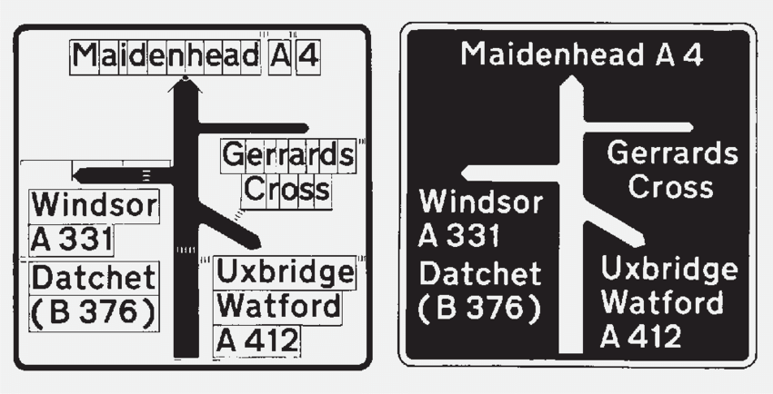
Fig 2 : Example of the Transport Typeface and its spacing system taken from the original design document from Jock Kinneir and Margret Calvert.
Lund, O. (2003). The public debate on Jock Kinneir’s road sign alphabet. [online] Available at: https://jockkinneirlibrary.org/assets/media/Lund-Ole.-2003.-The-public-debate-on-Jock-Kinneir%E2%80%99s-road-sign-alphabet.-Typography-Papers.-5.-103%E2%80%93126.pdf [Accessed 22 May 2025].
Baines, P. and Dixon, C. (2008). Signs : lettering in the environment. [online] London: Laurence King Pub. Available at: https://archive.org/details/signsletteringin0000bain_i8p4/ [Accessed 22 May 2025].
Spencer, H. (1961). Mile-a-Minute Typography? Typographica, 1(4). London: Lund Humphries. [online] Available at: https://www.maharam.com/stories/rawsthorn_typographica [Accessed 22 May 2025].
Baines, P. (1999). Eye Magazine | Feature | A design (to sign roads by). [online] Eye Magazine. Available at: https://www.eyemagazine.com/feature/article/a-design-to-sign-roads-by [Accessed 22 May 2025].
Alagiah, M. (2019). ‘It was such an important job that affected everybody’: Margaret Calvert in conversation with It’s Nice That. [online] Available at: https://www.itsnicethat.com/features/margaret-calvert-in-conversation-graphic-design-081019 [Accessed 22 May 2025].
The Design Museum (n.d.). Jock Kinneir and Margaret Calvert. [online] Design Museum. Available at: https://designmuseum.org/designers/jock-kinneir-and-margaret-calvert [Accessed 22 May 2025].
Design Indaba (2013). Margaret Calvert: It’s about knowing who you are designing for. [online] Available at: https://www.youtube.com/watch?v=pyBrrmDw6-k.