Back research Dec 2025
Designing Engagement Through Data & Reflection
It comes as no surprise that the environment and woodland that surrounds us has been struggling for decades. Within the UK, there has been a clear decrease in quality, as only 7% is considered “good condition” (Woodland Trust, 2025). It comes naturally, that as this decreases, so does the biodiversity that lives amongst these woodlands. Within the past 5 years, woodland birds have decreased by 15% (JNCC, 2023) and the population of dormice in surveyed woodland fell by 70% between 2000 and 2022 (Wyatt, 2023). These figures present an ecological crisis that extends beyond wildlife, highlighting a wider disconnect between people and the natural environments that surround them.
To address this, design must not only communicate awareness but encourage reflection and reconnection. This essay will explore how the “Calm Technology” movement, in addition to humanised data visualisation, can be used as tools for environmental mindfulness. It examines how reflective interaction, as well as introspective design, can promote more lasting awareness than overstimulation or alarmist messaging and design. These theories provide a framework that informs later design decisions within this project, guiding an approach centred on quiet reflection and empathetic interaction.
In doing so, the project positions graphic design as a form of social activism: not simply presenting information, but shaping cultural attitudes and behaviours around biodiversity. By aligning with the Woodland Trust’s mission to widen public engagement and support for declining woodland ecosystems, the design aims to bridge the gap between abstract ecological data and human experience, demonstrating the wider social role of design in creating collective responsibility.
One such movement which influences this is Calm Technology. The term was first coined by Mark Weiser and John Seely Brown in their 1995 paper on the topic. It primarily suggests that the interaction between technology and its user is designed to occur in the user’s periphery, rather than being the centre of attention. Weiser and Brown described it as technology “which informs but doesn’t demand our focus or attention”.
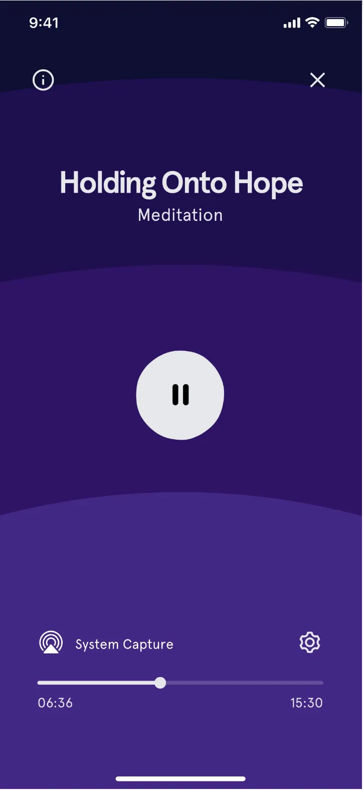
Practical examples can be seen often in meditation apps such as Headspace (fig. 1). Here, animations within the app are slow and purposeful, guiding users through breathing exercises or meditation sequences at a measured pace, supporting reflection and focus, enhancing the user’s own introspection. By developing this thoughtful link with the user, ideas are more likely to resonate and endure.
However, there are of course disadvantages to this approach. One challenge lies in the risk of under-engagement. By deliberately keeping interactions subtle, there is a chance that users may not notice important information or fail to engage meaningfully with the content. Calm Technology can also have the effect of oversimplifying information and hence downplaying the urgency of the situation. As well as this, there are also accessibility concerns. Interfaces that rely on subtle cues, ambient notifications, or minimal prompts may not be as effective for all users, particularly those with visual or auditory impairments.
With this in mind, it’s important to find a balance between the calm interaction and moments of more explicit engagement. For example, using Calm Technology when the user should be quiet and reflective. When I want the user to instead take action, clearer visualisations and contextual information should be used instead.
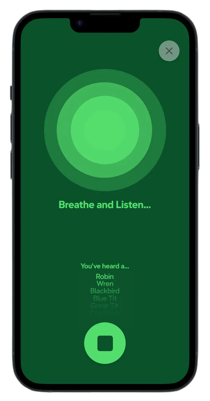
These same principles inform the design of my own app, which focuses on listening to natural sounds and recording the animals heard. By keeping the interface calm and reflective (fig. 2), with subtle visualisations of the recorded sounds and identified species, the users can focus fully on the environment around them. Gentle interactions allow them to notice and reflect on different species in their local woodland, internalising awareness of environmental change without feeling rushed or overwhelmed. In this way, Calm Technology not only supports engagement, but also develops a sense of environmental mindfulness, helping users form a lasting connection with nature and species native to their local woodland.
Data Humanism is a design approach that presents information in a way that’s personal and meaningful to users, rather than an abstract, or overwhelming way. This thought process is outlined in a manifesto by Giorgia Lupi (2019), where amongst other things, she suggests that infographics should “Sneak context in” and design in a way to “connect numbers to what they really stand for: knowledge, behaviours, people”. By personalising and presenting data to users in a meaningful way, designers can encourage reflection and create lasting engagement.
A clear example of this is Spotify Wrapped (Spotify, 2024). Each year, Spotify generates a personalised summary of a user’s listening habits and statistics, displaying it through visually appealing and interactive graphics. The data is framed around the user’s own behaviour, turning raw data and statistics into an intriguing story about their preferences and experiences. This reflective showcase encourages users to explore, share, and revisit the content, as well as creating a huge social media buzz as users share it to each other (Itsnicethat.com, 2024).
While Data Humanism offers a powerful way to make abstract information more personal and meaningful, it also presents several challenges. One limitation is the risk of oversimplification. By framing complex data through personalised stories or playful visualisations, there is a danger that the seriousness of the issue may be lost, leaving users with an incomplete understanding of the issue. Another challenge is bias and subjectivity. Because Data Humanism often crafts information to individual users, the framing of data can unintentionally emphasise certain narratives while downplaying others. This risks creating a skewed perception, particularly if users only see data that reflects their own activity rather than broader systemic trends. These challenges highlight the importance of designing carefully, ensuring that personalisation enhances, rather than distorting.
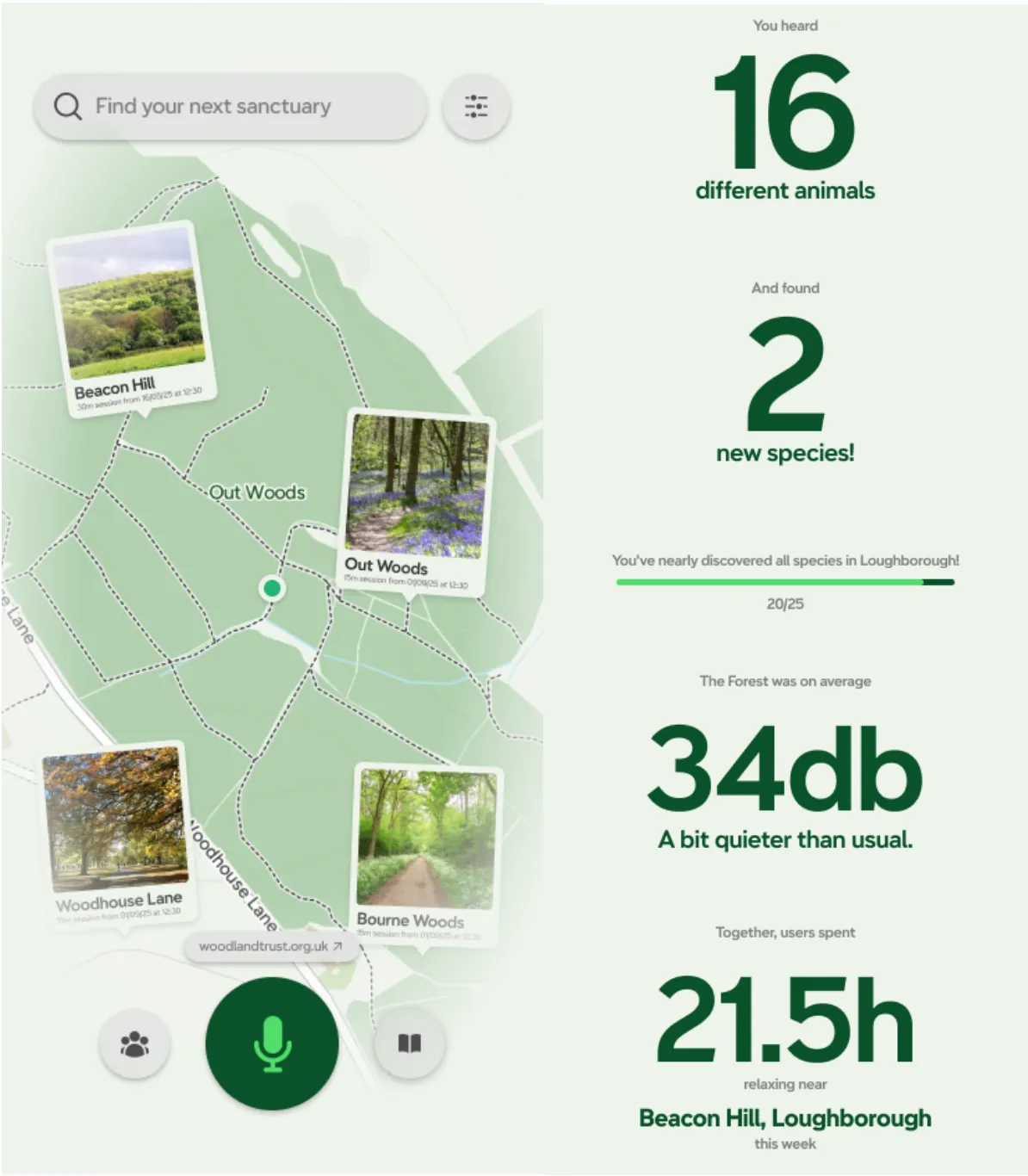
Applying the principles of Data Humanism to my app allows environmental data to be presented in a way that is both personal and reflective (fig. 3). Instead of abstract statistics, users can see an interactive map with a variety of different filters, showcasing abstract information such as Air Quality and Noise Pollution in an easy to grasp way. Furthermore, different pins are placed on the map, showcasing where others have recently relaxed, allowing users to easily explore new locations with new sounds. In conjunction with this, after each meditation, the user is greeted with a summary screen. On this screen, a variety of different statistics is shown to the user, such as the amount of animals heard, how much total time users have spent in one location, as well as audio levels to gauge how peaceful or active the forest is.
This approach has been seen before in the project Dear Data by Giorgia Lupi and Stefanie Posavec, where everyday personal data was hand‑drawn into intimate visual narratives. This project transformed abstract statistics into human stories, much like my app reframes biodiversity data as personal experiences. While Dear Data focused on individual habits, my design applies the same approach to ecological change, turning environmental statistics into reflective narratives that connect users to both their own contributions, and the wider Woodland Trust community.
To help with some of the downsides of data humanisation, my app design puts an emphasis on balance. While the personalised summaries and interactive maps make the data engaging, the user is still able to view the raw data and statistics of different species through the use of the Library tab. To reduce bias, the app combines individual insights with community data, allowing users to see both their own contributions and the bigger picture.
By shaping the information around each user’s own interactions, in the same way that Spotify Wrapped highlights listening habits, the data takes on a more personal meaning. It encourages people to notice patterns in local biodiversity, to recognise the part they have played, and to share their observations with others. In this way, environmental data is turned into a story of involvement, helping people connect with the app and building a deeper, longer-lasting awareness of local ecosystems.
At its heart, this project shows how reflective interaction and more human-centred data visualisation can help people engage meaningfully with environmental issues. Drawing on the principles of Calm Technology, the app invites users to pause, pay attention, and rebuild a sense of connection with the natural world. Through the lens of Data Humanism, abstract ecological data becomes something more personal, stories that speak to individuals and communities in ways that feel relevant and real.
The importance of this work reaches well beyond a single app. At a time when biodiversity is declining at pace, designers carry a responsibility to use their skills not only to inform but also to inspire. By aligning with the Woodland Trust’s mission to broaden public engagement with woodland biodiversity, the project presents graphic design as a form of activism: a means of turning ecological urgency into reflective, personal experiences that can influence cultural attitudes. In treating design as both communication and activism, the work underlines the wider social role of graphic design in encouraging collective responsibility and supporting systemic change.
West, A. (2025). Variety of wildlife in UK’s woodlands falling as habitats degrade, says report. [online] the Guardian. Available at: https://www.theguardian.com/environment/2025/jun/10/variety-of-wildlife-in-uks-woodlands-falling-as-habitats-degrade-says-report [Accessed 3 Nov. 2025].
JNCC (2023). Birds of the wider countryside and sea in the UK, 1970 to 2023. [online] data.jnnc.gov.uk. Available at: https://data.jncc.gov.uk/data/7162735c-9fa7-4962-aee7-709d242173f1/UK-BDI-2024-birds-wider-countryside.ods [Accessed 3 Nov. 2025].
Wyatt, I. (2023). Hazel dormice have declined by 70% since 2000, new report finds - PTES. [online] People’s Trust for Endangered Species. Available at: https://ptes.org/press-release-hazel-dormice-have-declined-by-70-since-2000-new-report-finds/ [Accessed 3 Nov. 2025].
Weiser, M. and Seely Brown, J. (1995). Designing Calm Technology Designing Calm Technology. [online] Available at: https://people.csail.mit.edu/rudolph/Teaching/weiser.pdf [Accessed 3 Nov. 2025].
Osborne, E.L., Ainsworth, B., Hooper, N. and Atkinson, M. (2023). Experiences of using digital mindfulness-based interventions: Rapid scoping review and thematic synthesis (Preprint). Journal of Medical Internet Research, [online] 25(1), pp.e44220–e44220. doi:https://doi.org/10.2196/44220.
Siegel, M.A. and Beck, J. (2014). Slow change interaction design. Interactions, 21(1), pp.28–35. doi:https://doi.org/10.1145/2542649.
Itsnicethat.com. (2024). Reinvention and evolution: Inside the design of Spotify Wrapped 2024. [online] Available at: https://www.itsnicethat.com/features/spotify-wrapped-2024-graphic-design-041224.
Lupi, G. (2020). Data Humanism. [online] Data Humanisation. Available at: https://giorgialupi.com/data-humanism-my-manifesto-for-a-new-data-wold [Accessed 3 Nov. 2025].