Projects Motion Design Feb 2026
Data Visualisation
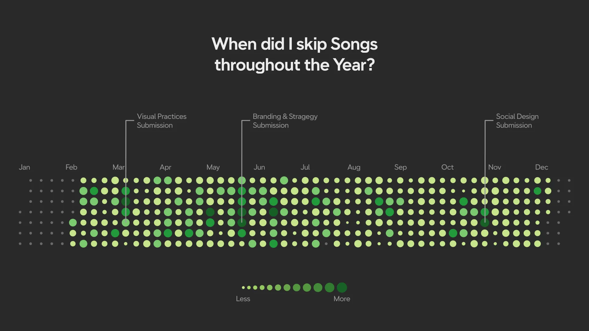
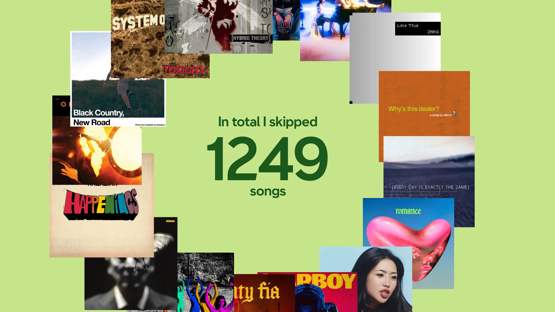
This project explores personal music listening behaviour through the lens of skipped songs, using my own Apple Music data from 2025. I wrote a custom program to analyse over 34,000 listening events, extracting statistics on when, why, and how I skip tracks.
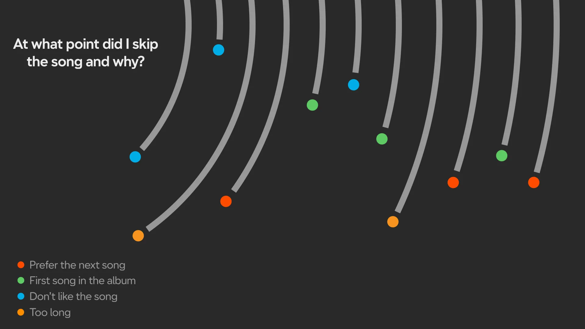
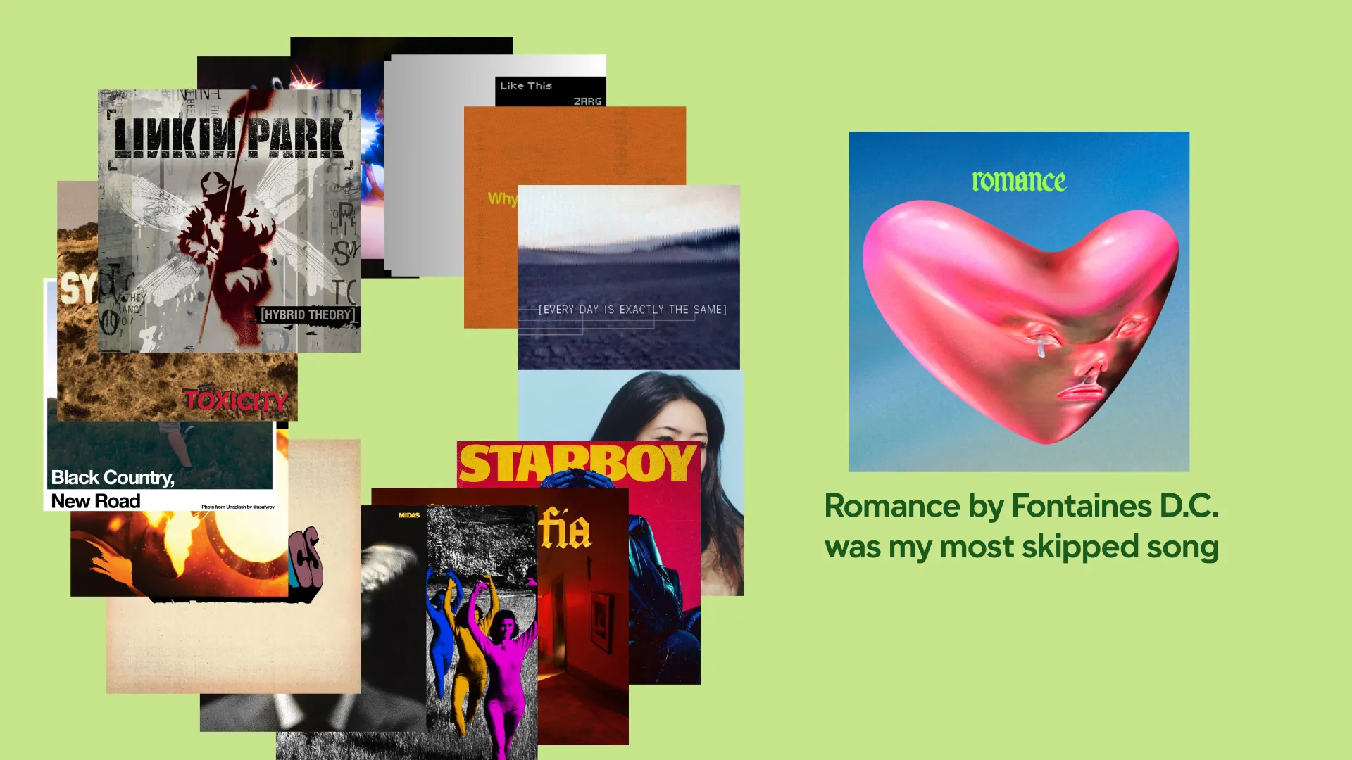
The final animation is structured across three scenes: a year-long heatmap of daily skips annotated with personal events, a timeline visualising how far through each track I listened before skipping and why, and a closing section of curated statistics and standout songs. The visual style is deliberately minimalist, drawing on Edward Tufte's data-ink principles and the clarity of the NYC subway map, using circular dot grids, a restrained green palette, and AT Name Sans to keep the data front and centre.
My Final Data Visualisation
My Final Data Visualisation
Date
13 Feb 2026
Client
Mock Brief
Dataset
34,899 Apple Music events
Visual Evidence
Tools
After Effects / Python / Excel
touchpoints
Motion Graphic / Data Animation
disciplines
Data Visualisation / Motion Design / Information Design