Will Baker
Graphic Design @ Loughborough Uni

[research] 12 Nov 2025
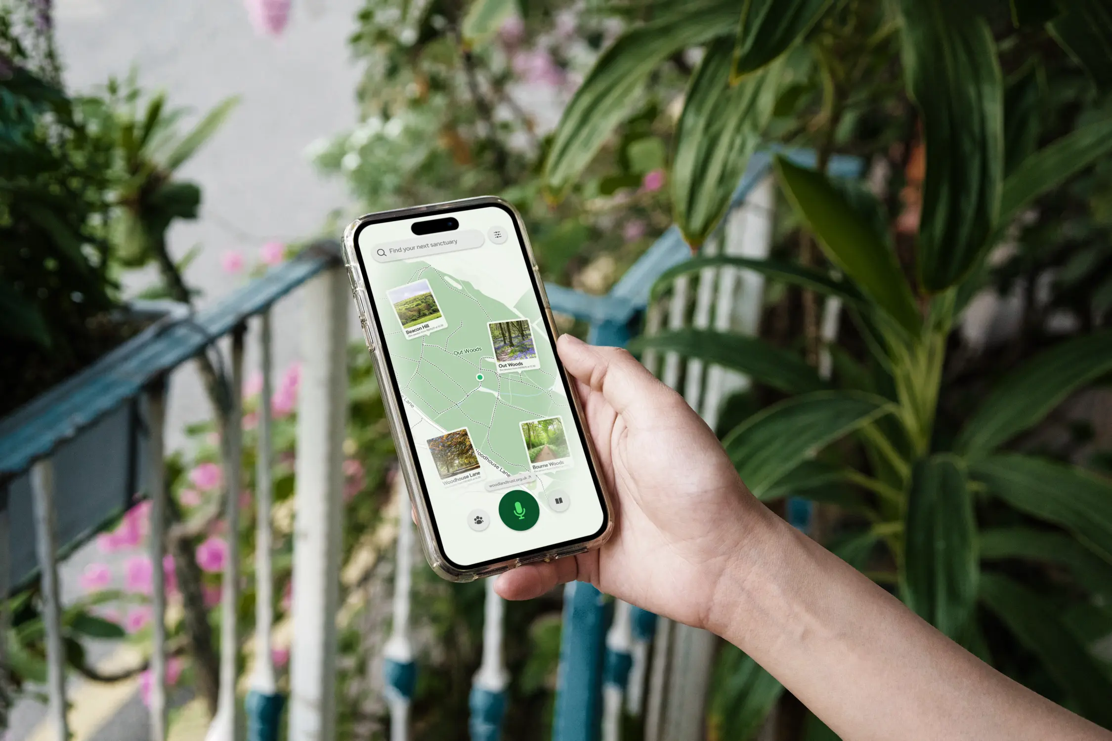
Designing Engagement Through Data & Reflection
Exploring calm technology and humanised data to foster mindful engagement with woodland biodiversity.
[research] 30 Jun 2025
Designing a Visual Language for the Road
A summary of how Jock Kinneir and Margaret Calvert transformed British road signage through a unified design system.